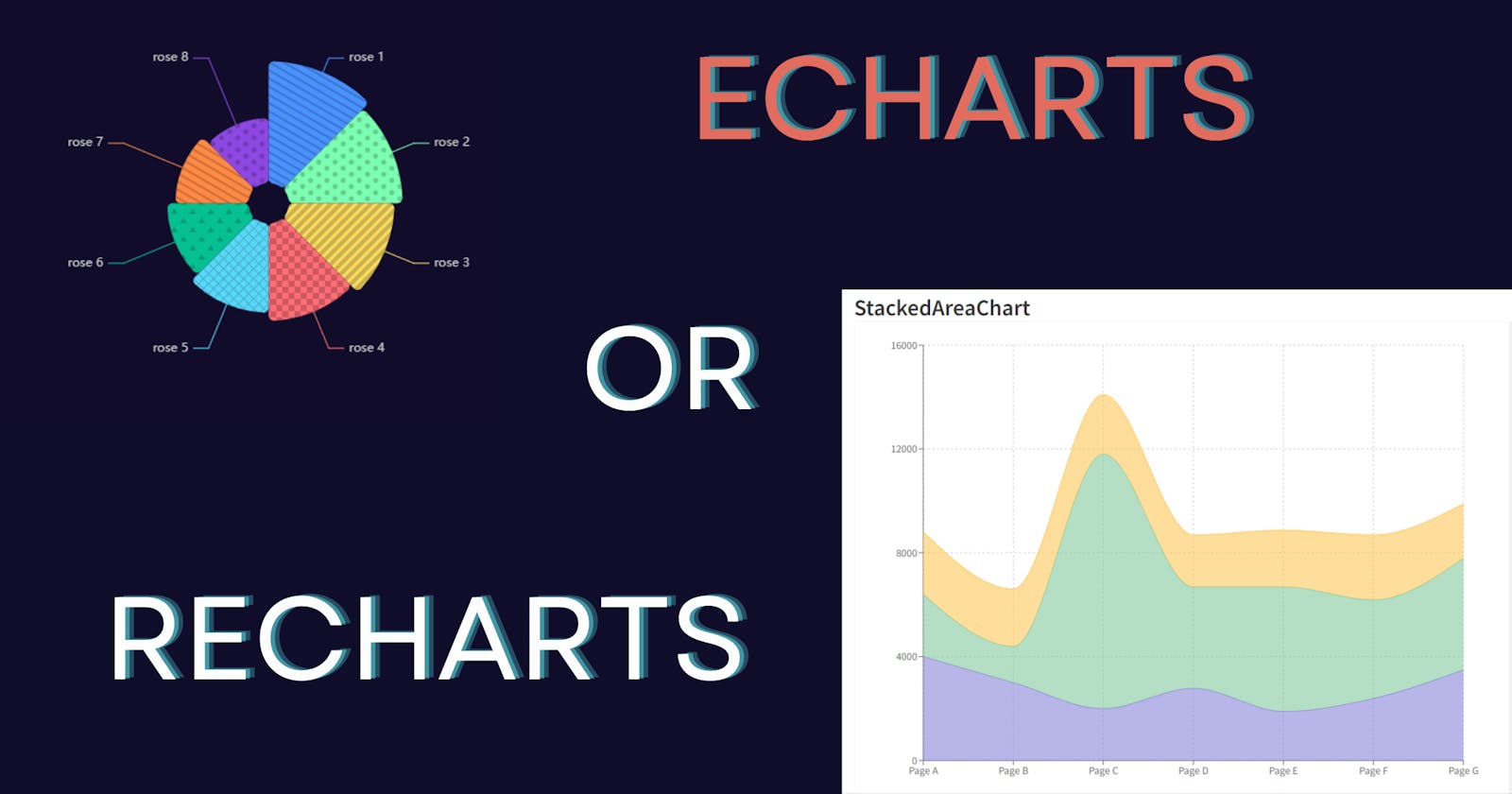
ECharts vs. Recharts vs. Chart.js: Choosing the Right Charting Library for Your Next.js Dashboard
In my latest work assignment, I undertook the task of revamping our product's dashboard module. The current iteration utilized Chart.js, but it was apparent that enhancements were necessary to elevate the dashboard's aesthetics, user experience, and overall functionality. This called for a critical decision: either refine the existing implementation or migrate to a new charting library altogether. This started a long research on the different open source visualization libraries.
The Behemoth and The Minimalist
The Behemoth in the sense of sheer power and versatility in customization is D3.js on top of which many charting libraries are made (Ex. ECharts, Recharts, Reaviz etc) . On the other hand there are libraries like Chart.js which can be called Minimalists when compared to D3.js. The one primary difference between D3.js and Chart.js is that while one primarily renders SVG based charts the other one renders HTML based charts. Both have their fair share of pros and cons which we will be seeing.
D3.js
Pros
Flexibility and Control: D3.js offers unparalleled flexibility and control over every aspect of data visualization. It allows developers to create highly customized and intricate visualizations tailored to their specific needs.
Extensive Feature Set: It provides a wide range of features and capabilities for creating almost any type of data visualization imaginable, including complex interactive visualizations.
Large Ecosystem: D3.js has a vast ecosystem of plugins, extensions, and examples created by the community, providing additional functionality and inspiration.
Data-Driven: D3.js is deeply rooted in the concept of data-driven documents, enabling dynamic updates and interactions based on changes in data.
Cons
Steep Learning Curve: D3.js has a steep learning curve, especially for beginners or those unfamiliar with concepts like SVG manipulation and data binding.
Verbose Code: Creating visualizations in D3.js often requires writing more code compared to higher-level libraries like Chart.js, which may increase development time and maintenance overhead.
Limited Defaults: Unlike Chart.js, D3.js does not provide pre-styled defaults for charts, requiring developers to design the visual appearance from scratch.
Chart.js
Pros
Ease of Use: Chart.js is known for its simplicity and ease of use. It provides a high-level API that abstracts away many of the complexities of data visualization
Beautiful Defaults: It comes with visually appealing default styles for various chart types, making it suitable for quickly creating aesthetically pleasing charts.
Good for large datasets: Since chart.js renders HTML canvas charts they handle a large datasets easily compared to SVG based charts which might require millions of nodes
Good Documentation & Community Support: It has a large and active community, which means there are plenty of resources, plugins, and third-party extensions available.
Cons
Limited Customization: While Chart.js provides some customization options, it may not offer the level of flexibility and control that more advanced users require.
Limited Chart Types: It supports a decent range of chart types, but compared to D3.js, it may lack some of the more specialized or complex chart types.
Decision
At this point, we are faced with the challenge of choosing a path

Be Neo and take the red pill to get an unlimited range of possibilities in terms of customization, creativity, and performance but with a very unpredictable learning curve full of unfamiliar concepts, or choose the blue pill to get a simple and quick setup with limited yet polished functionality and settings. I hope at this point you know what kind of charting library you want for your dashboard.
If you are like me and are confused about choosing one, don't worry because we just have the right blend of both worlds readily available. I wanted both high customization and a wide variety of chart options while still retaining good performance and ease of use. Blending the red and blue resulting in the "Hollow Purple".

Enter Recharts and ECharts
Among the hundreds of charting libraries available that are built on top of D3.js, I feel Recharts and ECharts offer great value. If you aren't an anime fan and couldn't understand this analogy, I will give you the interpretation. Hollow Purple because we get an abstraction where we don't have to build anything from scratch and write verbose code to build anything and purple as we get the best of both worlds of Red (D3.js) and Blue (Charts.js). Let's go over both Recharts and ECharts and what I chose for my Next.js project.
Recharts
Recharts is a charting library built on React components that makes it easy to create charts within React applications. It's composable, reliable, and powerful.
Simply deploy with React components.
Native SVG support, lightweight depending only on some D3 submodules.
Declarative components, components of charts are purely presentational.
Installation
npm install recharts
Sample Component
<AreaChart width={730} height={250} data={data}
  margin={{ top: 10, right: 30, left: 0, bottom: 0 }}>
  <defs>
    <linearGradient id="colorUv" x1="0" y1="0" x2="0" y2="1">
      <stop offset="5%" stopColor="#8884d8" stopOpacity={0.8}/>
      <stop offset="95%" stopColor="#8884d8" stopOpacity={0}/>
    </linearGradient>
    <linearGradient id="colorPv" x1="0" y1="0" x2="0" y2="1">
      <stop offset="5%" stopColor="#82ca9d" stopOpacity={0.8}/>
      <stop offset="95%" stopColor="#82ca9d" stopOpacity={0}/>
    </linearGradient>
  </defs>
  <XAxis dataKey="name" />
  <YAxis />
  <CartesianGrid strokeDasharray="3 3" />
  <Tooltip />
  <Area type="monotone" dataKey="uv" stroke="#8884d8" fillOpacity={1} fill="url(#colorUv)" />
  <Area type="monotone" dataKey="pv" stroke="#82ca9d" fillOpacity={1} fill="url(#colorPv)" />
</AreaChart>
This library can be used easily even in Next.js projects to quickly set up the dashboard for your project. There are a lot of properties available which can be seen in the documentation and updated accordingly. There are 11 primary types of charts available using which a variety of charts can be developed.
ECharts
Developed by Apache, it is a free, powerful charting and visualization library offering easy ways to add intuitive, interactive, and highly customizable charts to your commercial products. It is written in pure JavaScript and based on zrender, a new lightweight canvas library.
The wide variety of chart options provided by ECharts helps build a unique dashboard of charts. It offers
Great flexibility
Performance
Rich, Well-Documented API.
To use ECharts in Next.js, we will use the echarts-for-react npm wrapper, which has echarts as a peer dependency.
npm install --save echarts-for-react

npm install --save echarts
After the installation, we can use it in our components by importing as follows
import ReactECharts from 'echarts-for-react';

// render echarts option.
<ReactECharts option={this.getOption()} />
Conclusion
Both Chart.js and D3.js based libraries like ECharts and Recharts offer distinct advantages and cater to different needs in the realm of data visualization for web development.
For projects where simplicity, ease of use, and rapid development are paramount, Chart.js stands out with its intuitive API, visually appealing defaults, and responsive design. It provides a solid foundation for creating basic to moderately complex charts without requiring extensive coding expertise.
However, for projects requiring more advanced customization, interactivity, and scalability, Echarts and Recharts present themselves as formidable contenders. Built on top of D3.js, these libraries offer a wealth of features, extensive documentation, and a vibrant ecosystem of plugins and extensions. While they may entail a steeper learning curve, Echarts and Recharts provide unparalleled flexibility and control over data visualization, making them well-suited for complex dashboard applications and data-intensive projects.
Ultimately, the selection between Chart.js and Echarts/Recharts hinges on the specific requirements, objectives, and technical expertise of your project team. Whether you prioritize simplicity, versatility, or fine-grained control, both sets of libraries empower developers to create compelling and impactful visualizations that elevate the user experience and drive insights from data.

